Hidden Objects: Adventures & Mysteries
![]()
HOA & HOM logotype
Early explorations on logo and app icon of these games that went along with competitive apps visuals analyze gave us understanding of what we would like to see as icon: a beautiful scene photo that goes along with simple text — Hidden Objects. Surfing through the app store icons, the only HO (Hidden Objects) games were catching the eye had icons with the text saying it’s HO game’s icon. Therefore, the aim was set as just anything clearly stating HO nature and visually pleasant picture so that anyone who’s looking for HO game/app can easily identify the icon/logo.
![]()
App’s Store Icon
Type style inspiration came from Square Capitals, very few examples of which had survived. It’s distinctive and easily readable look combined with strong contrast suits the aim perfectly. Eventually, 26 letters, roman numerals and necessary punctuation characters were written and vectorised to be used throughout the app.
Initial vector shapes that were gotten from sketches was then adjusted for better display legibility when logo/text is shown in small size. Complete character set and pangram uses could be seen here.
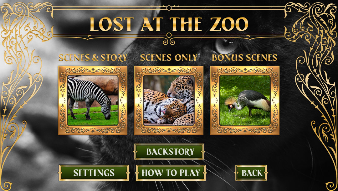
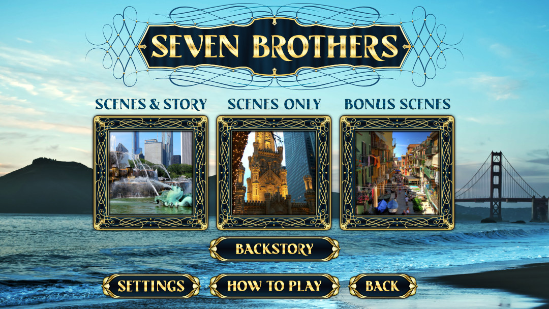
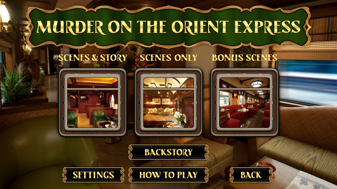
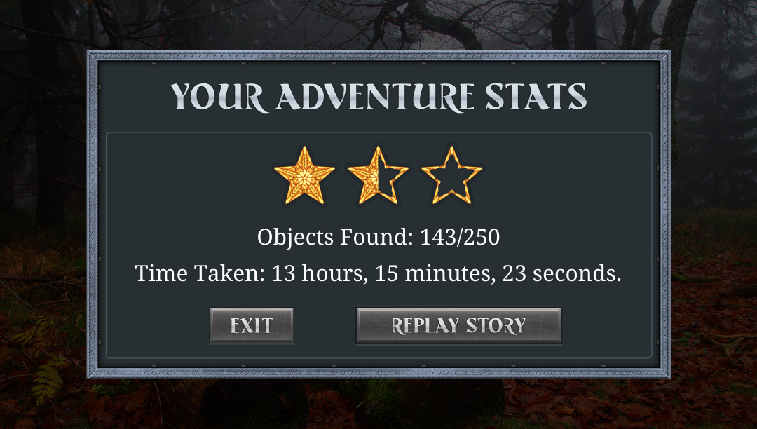
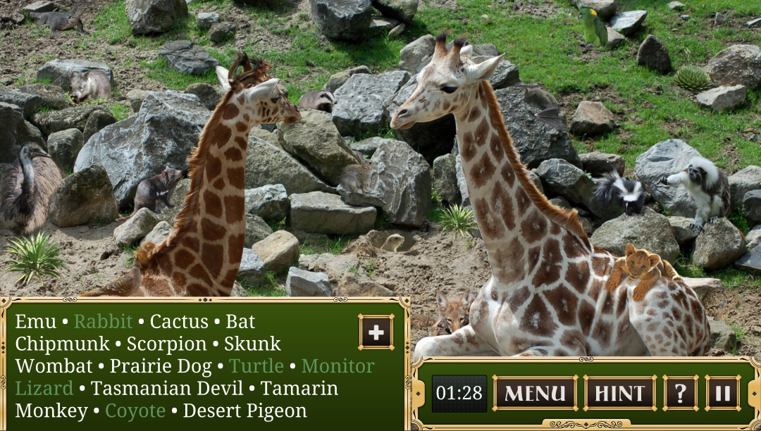
This App is a ‘6 in 1’ pack of games: Adventures and Mysteries has 3 Stories per each game. Initially, there was a requirement to style each Story’s UI differently. Custom font and similar UI elements placement are the only similarities user can observe playing different stories.
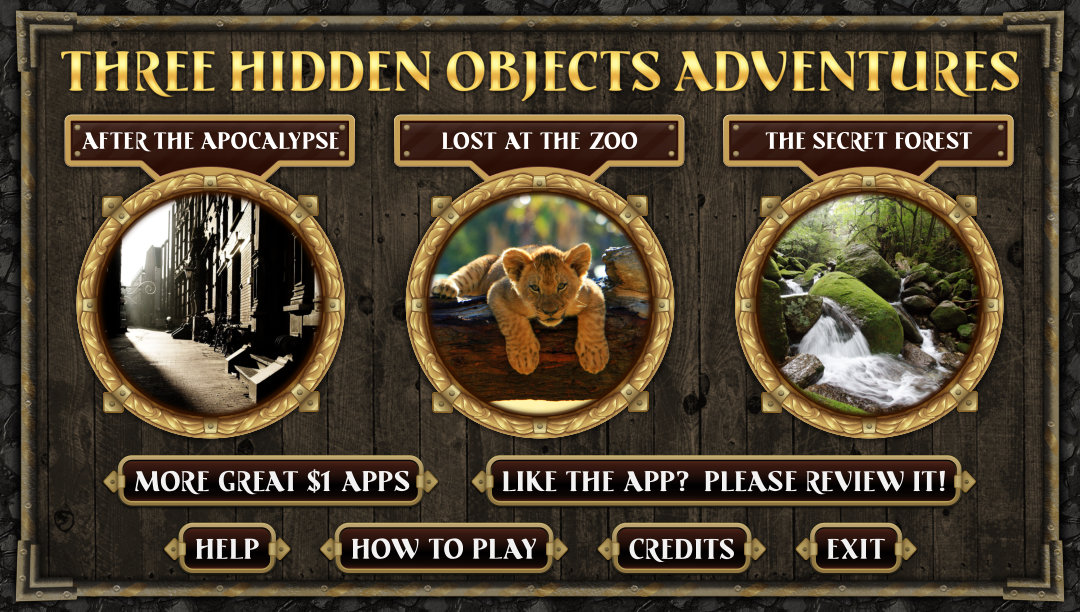

Adventures Start Screens
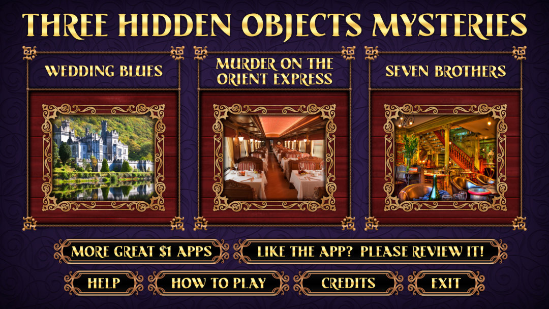
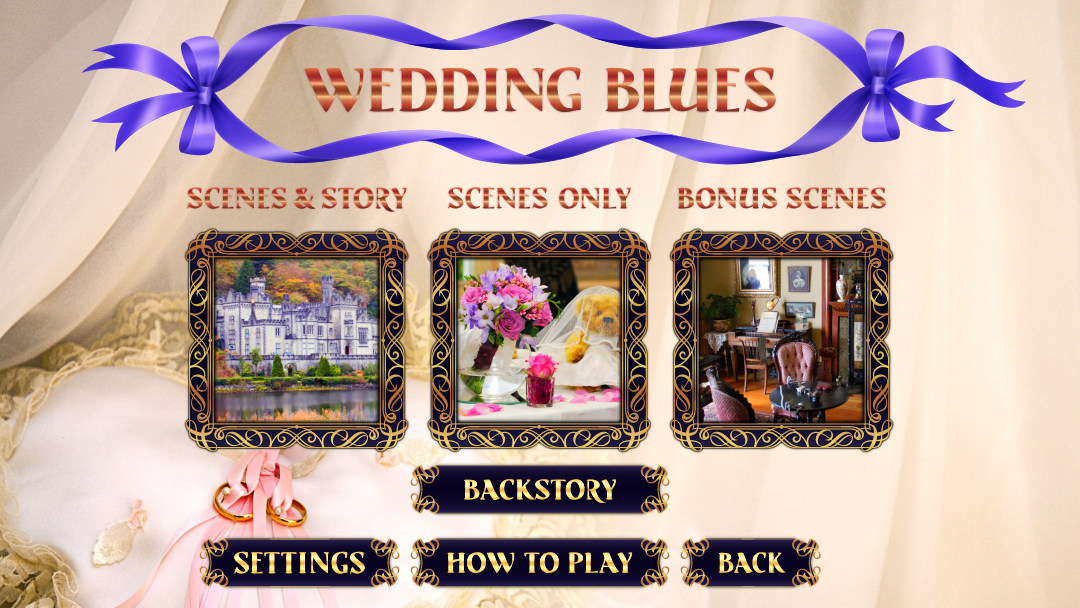
Mysteries Start Screens
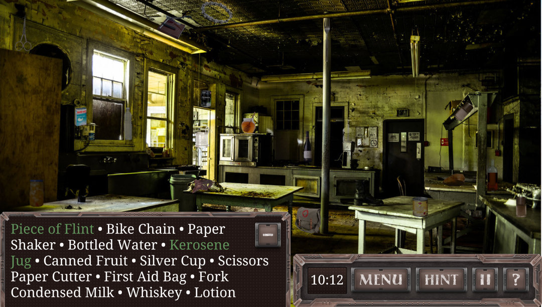

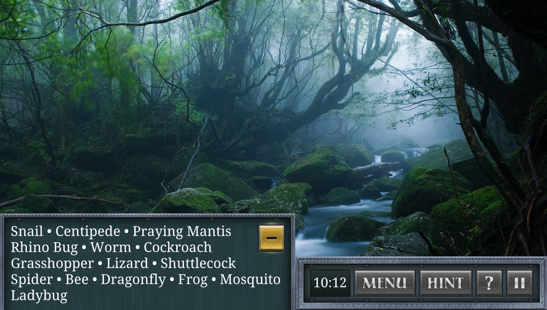
Misc UI designs of different Stories